Overview
Led the end-to-end redesign of the job detail page - a core experience for students exploring career opportunities in a difficult period of their journey into professional life. This high-impact project aimed to increase engagement, reduce bounce rates, and improve usability on mobile and desktop platforms.
Key outcomes
📈 Increased job applications to a record high of 300k over 30 days post launch, a record high and 78% increase on the previous years peak period.
💬 Qualitative data highlighted less friction for students and employers flagged the increase in ease of posting new listings.
🔍 Increase in job interaction rate, with an overall boost to job saving and start-application clicks.
My Role
As the sole UX/UI Designer and strategist, I owned the entire design process from discovery and ideation through to visual design and implementation. I collaborated closely with developers, PMs, and stakeholders to ensure the redesign delivered measurable impact and felt cohesive across the broader product, aligning with the existing brand while incorporating much needed improvements.
Journey
-
Analytics and usability testing showed students felt overwhelmed by inconsistent layouts and struggled to locate key information, particularly on mobile (which is an increasing population of users around 50%).
I ran usability tests and mapped user journeys to uncover pain points and emotional friction moments.
-
We conducted a mix of quantitative and qualitative research to understand user behaviour and needs:
Analytics review: Identified high bounce rates and low engagement on mobile
User testing: Observed how students navigated job pages and where they got stuck
Surveys & feedback: Gathered direct input from students and employers
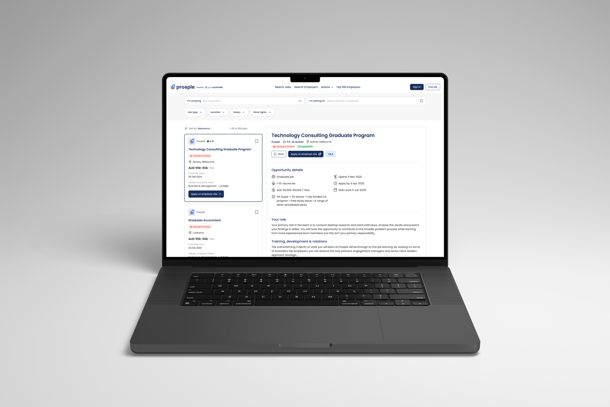
Users found the page dense and hard to scan, with key details buried or inconsistently placed. This directly informed our redesign priorities.
-
we translated research insights into clear design opportunities and a roadmap:
Identified key issues: poor info hierarchy, unclear CTAs, lack of mobile optimisation
Prioritised improvements based on impact and feasibility
Defined success metrics: increased job saves, applications, and time on page
Created a phased rollout plan: starting with low-fidelity prototypes, then iterating based on feedback
This ensured a focused, measurable approach aligned with both user needs and business goals.
-
During this phase, we rapidly prototyped and refined solutions through feedback loops:
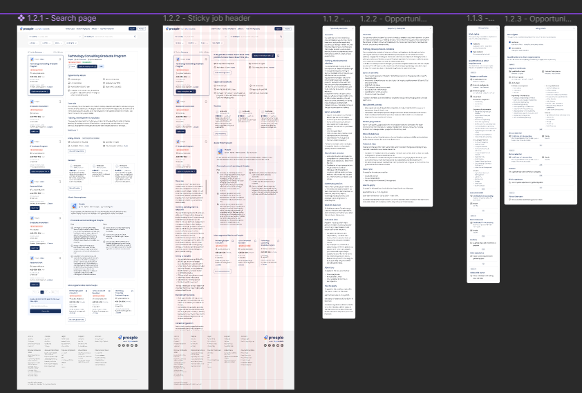
Created wireframes and interactive prototypes in Figma for both mobile and desktop
Focused on modular layout, clear visual hierarchy, and consistent component use
Tested designs with students to validate usability and comprehension
Iterated based on feedback internal and external feedback, improving CTA visibility, grouping content logically, and optimising responsiveness
Multiple rounds of testing and iteration led to a design that was both functional and engaging, ready for development.
Jobs to be done
Lead UX strategy, interaction design, visual design, and prototyping
Collaborate with developers, PMs, and stakeholders
Design functional prototypes in Figma
Deliver UI assets under tight release schedules
Usability testing to ensure the achievement of project goals
Problem
User testing and analytics revealed that students found the job detail pages overwhelming, inconsistent in layout, and not optimised for quick scanning or application. Mobile users especially struggled with navigation and visibility of key CTAs.
Goals
Make it easier for users to evaluate roles quickly
Highlight unique employer offerings (e.g. culture, salary, perks)

Improve mobile UX without compromising desktop layout
Encourage more applications and job saves
Methods
User Research & Discovery
Mapped current user journeys and identified drop-off points
Ran moderated usability testing with students
Synthesised qualitative insights with analytics data (e.g. scroll depth, CTA clicks)
Wireframing & Iteration
Created low to high-fidelity wireframes for desktop and mobile
Explored multiple layouts for content prioritisation
Focused on a modular, scalable design system that aligned with ongoing design system projects
Visual & Interaction Design
Applied clean, consistent visual hierarchy
Used iconography and layout grouping to reduce cognitive load
Introduced visual affordances like “badge” labels (e.g. Hybrid WFH, Closing in 5 hours) to surface urgency and job value
Accessibility & Responsiveness
Ensured WCAG compliance with clear contrast and keyboard focus states
Optimised interaction for touch, tap targets, and screen sizes
Reflection
This project was a milestone in blending empathy with performance. It taught me how thoughtful design, informed by data and user behaviour, can transform a complex experience into something that feels simple and right. It also reinforced how collaborative, fast-moving design can balance user needs and business outcomes without hindering user experience. While some of the success is also due to the commitment to an overall greater experience across the site, this project was fundamental to a large increase in the perception of our site’s functionality and tone.